Print Pieces
Blending creativity with strategic design, my magazine and pamphlet designs aim to communicate ideas effectively, tell compelling stories, and maintain a unique aesthetic.
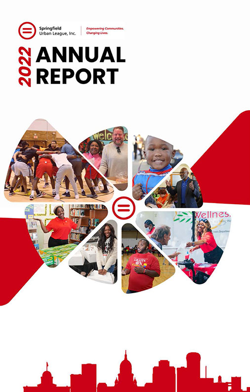
Springfield Urban League Impact Report
The Springfield Urban League (SUL) Impact Report is a thoughtfully designed publication that combines compelling visuals with clear, organized content. The layout emphasizes accessibility, featuring bold headings, engaging infographics, and impactful statistics that highlight key achievements. Strategic use of color and imagery enhances readability while reflecting the organization's vibrant mission. This cohesive design effectively balances storytelling with data, creating an engaging and professional presentation of SUL’s annual accomplishments.
Springfield Urban League
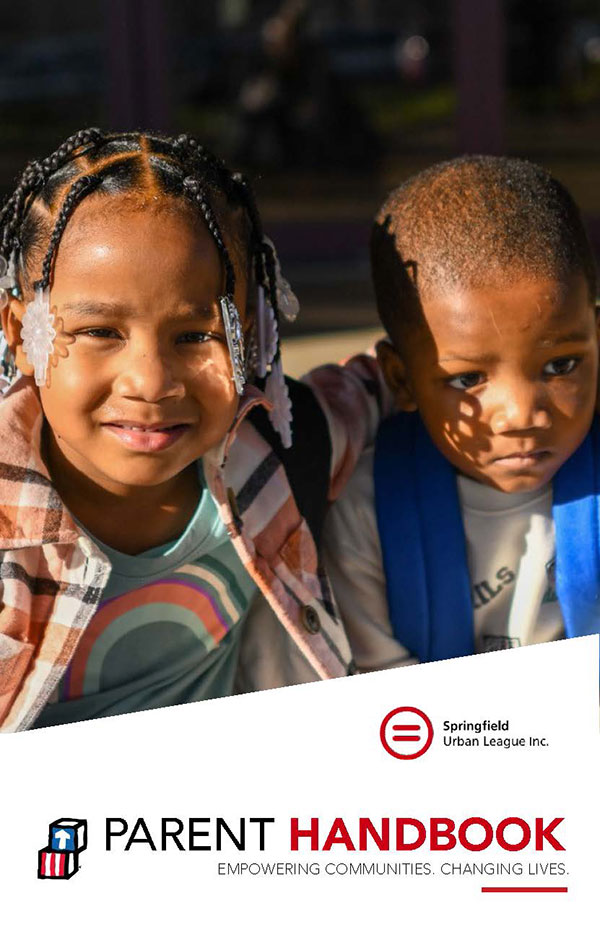
Parent Handbook
The Springfield Urban League Parent Handbook is a thoughtfully designed resource that provides parents with clear and comprehensive information about the Head Start, Early Head Start, and Wee Grow programs. With organized sections on policies, procedures, health requirements, and family involvement, the handbook emphasizes a family-centered approach to education. Its clean layout and approachable tone make it easy for parents to navigate and access the support they need to foster their child's development.
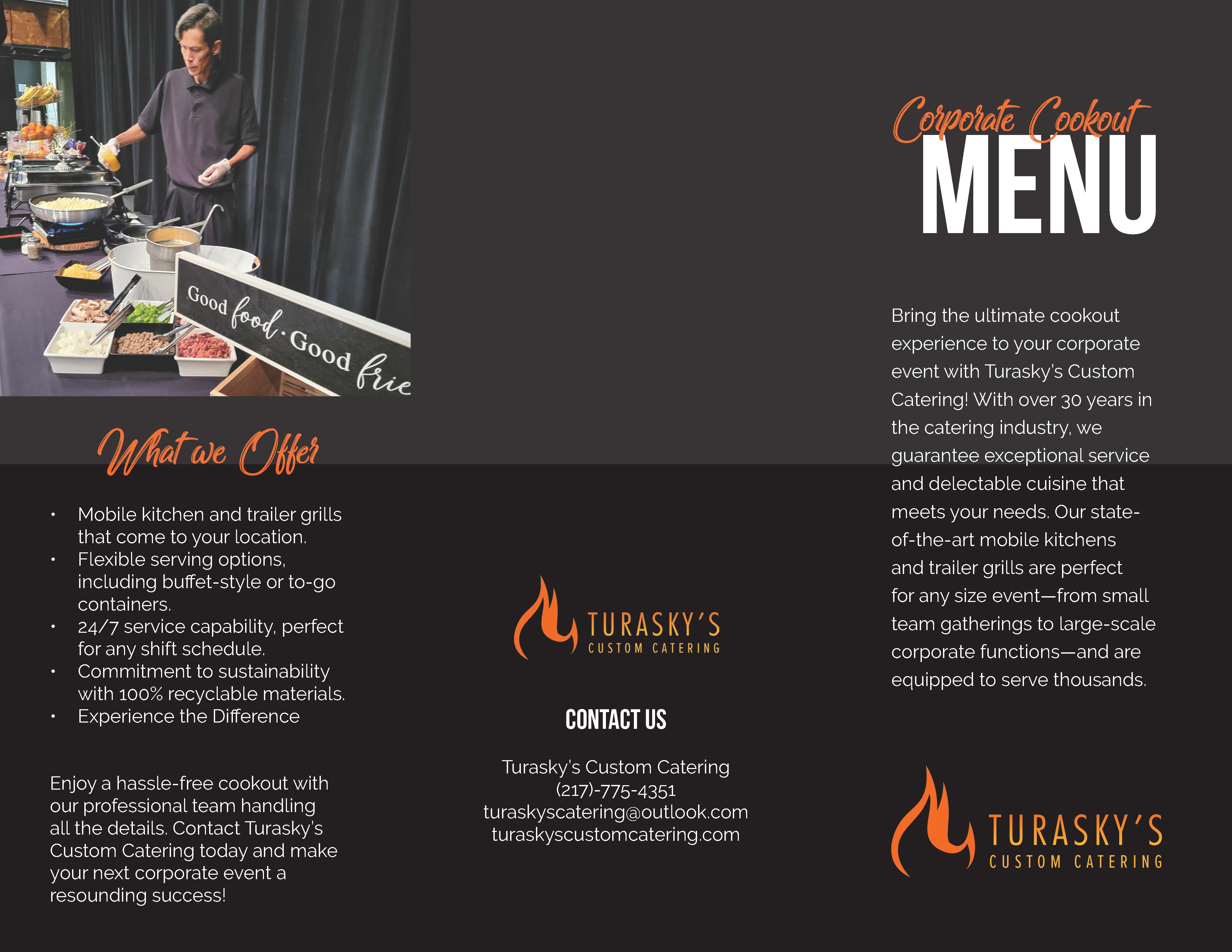
Turasky Custom Catering Brochure
The Turasky’s Custom Catering Brochure boasts a clean and inviting design that effectively highlights their services and menu. The layout is well-organized, using bold headings and clear sections to ensure easy navigation. Subtle use of color enhances readability without overwhelming the content, and the balanced combination of text and visuals ensures the information is both engaging and accessible. The overall design highlights a polished, approachable feel that reflects the quality and reliability of Turasky’s services.
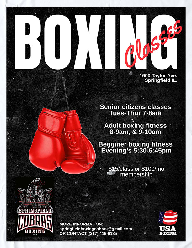
Cobra's Boxing Classes Flier
This dynamic and engaging flyer was designed to promote the Springfield Cobras Boxing Classes. The design features bold typography and striking imagery of boxing gloves to immediately capture attention and convey the energetic spirit of the sport. Key class information is clearly laid out for various audiences, including senior citizens, adults, and beginners. The use of contrasting colors, like red and white on a black textured background, ensures high readability and visual appeal. This flyer effectively combines functional design with an aesthetic punch, making it a standout marketing tool for Springfield Cobras.
MFS&W Company Banner
A modern, tech-inspired banner showcasing MSF&W’s key services: IT staffing, accessibility solutions, and IT modernization. Featuring clean typography, subtle patterns, and recognitions like BEP Certification and Google Cloud Partner, it conveys professionalism and innovation effectively.

Digital Assets
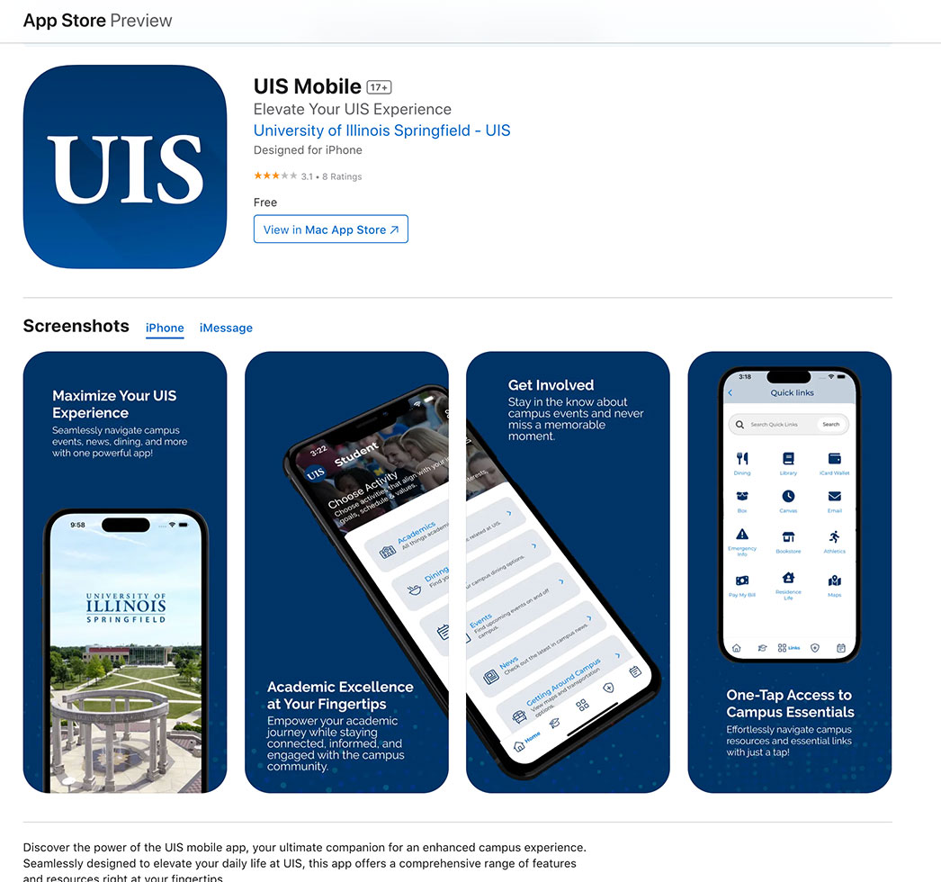
UIS Mobile Icon & Graphics
Designed a cohesive set of digital assets for the UIS Mobile App, including the sleek and professional UIS app icon. The assets highlight the app's key features, such as seamless campus navigation, one-tap access to resources, and real-time engagement with events and academics. Screenshots were crafted to emphasize usability and the app's role in enhancing the University of Illinois Springfield experience, ensuring a clean, modern design aligned with the UIS brand identity.
Digital Ads - MSF&W
Designed a cohesive set of digital assets for the UIS Mobile App, including the sleek and professional UIS app icon. The assets highlight the app's key features, such as seamless campus navigation, one-tap access to resources, and real-time engagement with events and academics. Screenshots were crafted to emphasize usability and the app's role in enhancing the University of Illinois Springfield experience, ensuring a clean, modern design aligned with the UIS brand identity.

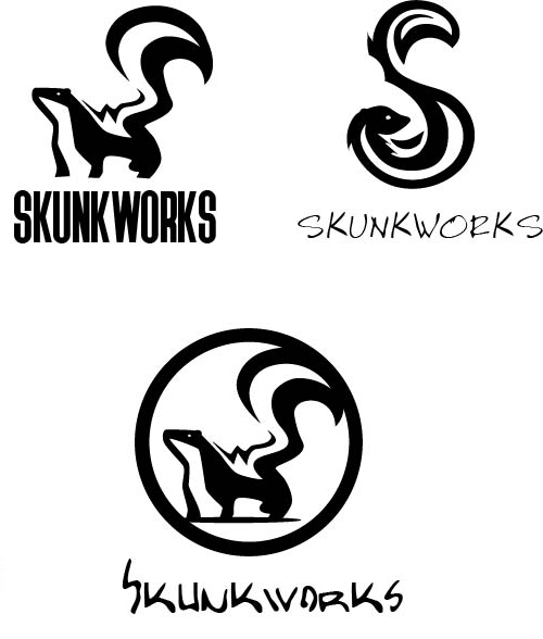
Logo Design
A great logo is more than just a graphic—it's the cornerstone of a brand's identity. I specialize in designing logos that are visually striking, meaningful, and adaptable, delivering designs that make an impact and build recognition.
